Arts & Culture · Architecture, fashion & design
How typefaces give words a voice
Learn to tell typefaces apart by their serifs and x-height, follow the London Underground's lettering and Helvetica from drawing board to street sign, and weigh the old argument over whether good type should be invisible.
What you will learn
- Identify serifs and stroke contrast and use them to tell serif families apart
- Explain what x-height measures and why sign and caption faces often raise it
- Describe what Frank Pick asked of Johnston's alphabet and how Roman capitals shaped it
- Trace how Johnston's 1916 alphabet was redrawn as New Johnston and Johnston100
Lesson 1 of 4 · 6 min
How to tell one typeface from another
Look at the foot of a capital T in a book or newspaper. The stroke doesn't simply stop. It ends in a small extra line. That line is a serif, and a typeface without serifs is sans-serif, from the French word sans, meaning without.
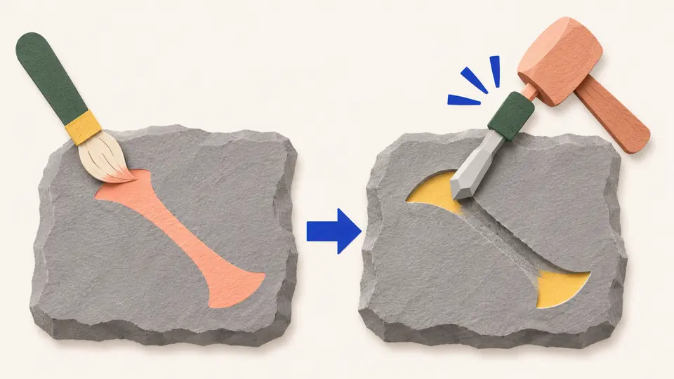
Serifs may be left over from paint. In 1968 Father Edward Catich proposed that Roman letters were first painted onto stone, and that carvers followed the brush marks, which flared at the ends of strokes. His account is broadly accepted, though not by everyone. A rival theory says serifs were added to neaten the ends of chiseled lines.
Serif typefaces fall into four groups, and the main clue is stroke contrast, the difference between a letter's thick and thin lines.
Old-style faces such as Garamond, a group dating back to 1465, have low contrast. Transitional faces, common from the mid-18th century, have more. Didone faces such as Bodoni and Didot push the contrast to an extreme, with very thin serifs and very heavy verticals. Slab serifs go the other way. They date to about 1817 and were made for posters, with serifs as thick as the main strokes.
Now compare the small letters with the capitals. The x-height is the height of a lowercase x. It's measured from the baseline, the line the letters sit on, up to the mean line along the tops of most lowercase letters.
Letters such as b and d have ascenders that rise above the mean line. Letters such as p and y have descenders that drop below the baseline. Round letters such as o poke slightly above the mean line, a correction called overshoot.
X-height does a lot to set how a typeface looks. You can check it yourself. Set the same word in two typefaces at the same size, and compare how tall the lowercase letters stand next to the capitals.
Many typefaces for signs and posters have high x-heights, so they can be read from a distance. Faces designed for small print, such as captions, raise it too. Faces for long stretches of text sit in the middle.
Taller isn't always better. Some research suggests a very high x-height can be counterproductive, possibly because a word's shape gets harder to recognize when every letter is nearly the same height. Some display faces, such as Cochin, keep theirs low for a more elegant, delicate look.
Try to recallA sign maker wants lowercase words to read clearly from across a station hall. How high should the x-height be, and what's the limit?
A fairly high x-height helps. The x-height is the height of lowercase letters such as x, between the baseline and the mean line, and many typefaces for signs and posters have high ones so they can be read clearly from a distance. The limit is that a very high x-height may be counterproductive, since words become harder to identify when every letter is nearly the same height.
Two checks will sort almost any typeface you meet. Look at the stroke ends for serifs and how thick they are. Then look at the x-height to see how tall the lowercase stands. Try both on the next sign you pass.
Lessons in this topic
How to tell one typeface from another
Spot serifs, stroke contrast and x-height, the three features that set one typeface apart from another.
How a calligrapher drew the London Underground's letters
In 1916 a calligrapher drew a sans-serif alphabet for London's Underground by hand. See what he was asked for, and how it has been redrawn for new ways of printing.
Helvetica and the promise of neutrality
See the features that make Helvetica dense and even, then weigh the claim that it carries no meaning of its own.
Should good type be invisible?
Beatrice Warde argued that printing should be invisible, like a crystal goblet, and Matthew Butterick replied that type always adds meaning.
Three quick stories from this topic
London's first sans-serif signs
A poet said London's new letters without serifs looked as if they had elephantiasis
In 1805 signwriters were painting plain letters with strokes of equal thickness over shops and walls. They were known as Egyptian. The public had never seen letters like them. The poet, Robert Southey, pointed out that the Egyptians had no letters.
A poet mocks the new letters
Robert Southey, writing in the character of a Spanish aristocrat in his satirical Letters from England, called them "the common characters, deprived of all beauty and all proportion by having all the strokes of equal thickness." The strokes that should be thin, he wrote, "look as if they had the elephantiasis."
From painted signs to printing type
The first signs were hand-painted or carved, since large sizes couldn't be printed. Around 1816, William Caslon IV produced the first sans-serif printing type in England for the Latin alphabet. It was a capitals-only face called Two Lines English Egyptian, about 28 points in size, and no uses of it from the period have been found.
Beatrice Warde's invented Frenchman
Beatrice Warde published her 1926 type research as a bearded Frenchman she had made up
Writing as Paul Beaujon, she showed that typefaces long credited to Claude Garamond were made 90 years later by Jean Jannon. Monotype then offered Beaujon an editor's post, and its London executives were astonished when a woman accepted.
Garamond or Jannon?
She concluded that many typefaces previously attributed to Claude Garamond were in fact made ninety years later by Jean Jannon, a lasting contribution to scholarship. Warde later noted that the deception confused other historians without being immediately suspected, though they were surprised to read a work by a Frenchman in idiomatic English.
An editor they expected to be a man
In 1927 Paul Beaujon was offered the part-time post of editor of the Monotype Recorder, and Warde accepted, to the astonishment of Lanston Monotype Corporation executives in London, who were expecting a man. She was promoted to publicity manager in about 1929 and kept the post until she retired in 1960.
How Helvetica got its name
Helvetica was nearly named Helvetia, but a sewing machine maker already used the name
The typeface came out in 1957 as Neue Haas Grotesk. When it was adapted for typesetting machines, a sales manager proposed Helvetia, Latin for Switzerland. The foundry's director pointed to the sewing machines and an insurance company, and suggested Helvetica, meaning Swiss.
A plain Swiss design
Max Miedinger began drawing it in 1956 for the Haas Type Foundry near Basel. A tall lowercase and tightly spaced letters give its text a dense, solid look.
Neutral, or corporate
The designer Wim Crouwel praised it as a typeface with no meaning of its own. Others came to associate it with authority and corporate power.
Sources
- Serif, Wikipedia
- Sans-serif, Wikipedia
- X-height, Wikipedia
- Beatrice Warde, Wikipedia
- Helvetica, Wikipedia